
With over 20,000 complaints and a 1-star App Store rating, the then MYmta app was in dire need of a refresh. The newly formed Digital Services team at the MTA was tasked to bring this outdated and unmanaged transit app up to speed. I led the complete design lifecycle—from user research to visual direction—focusing on making the product more map-centric and easier for riders to use.

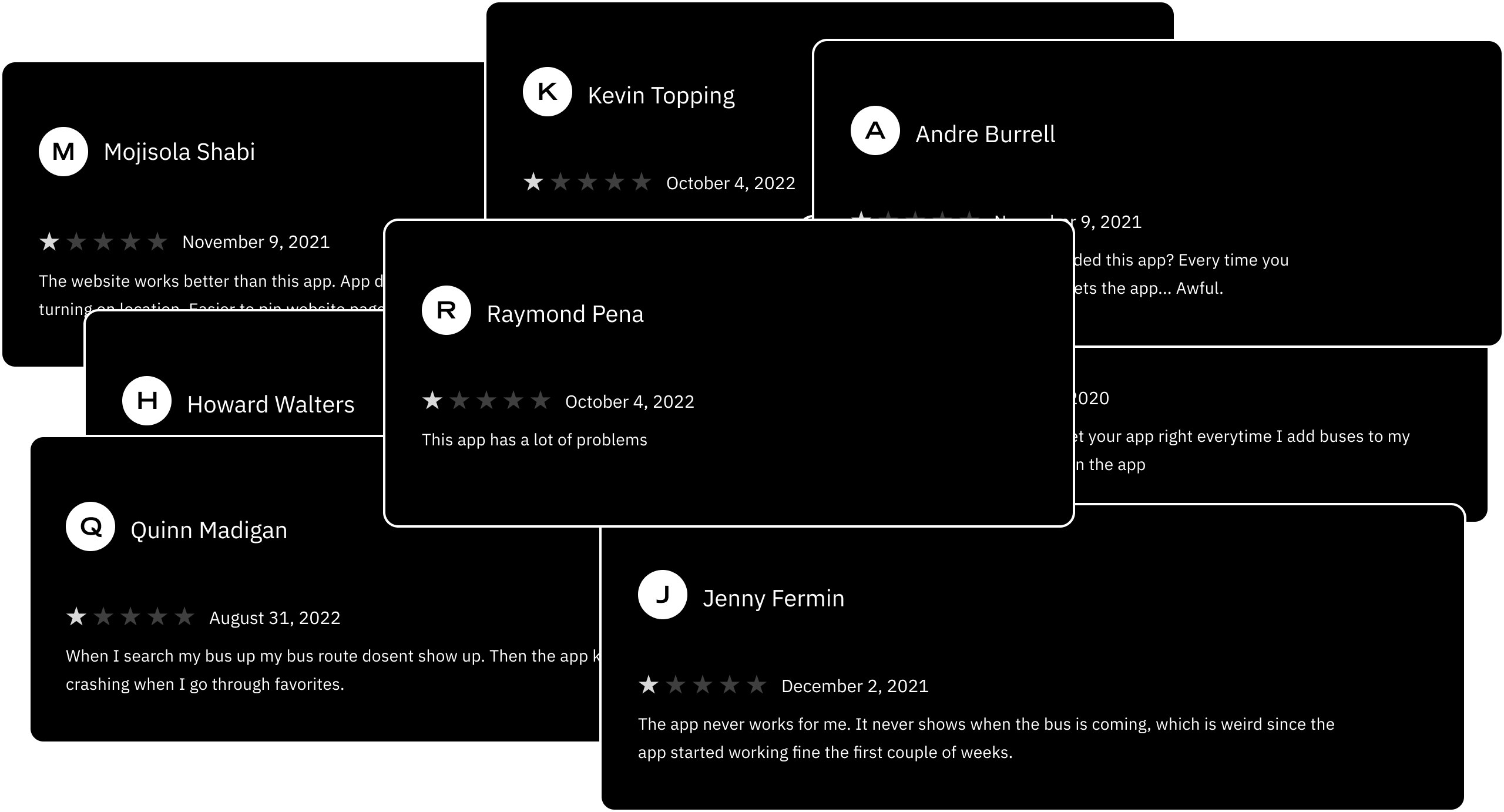
Launched in 2018, the then MYmta app had a horrific rollout. For nearly a year and a half, there were no teams put in place to manage this outdated, complex transit app. Joining MTA in late 2019, I was introduced to MTA's almost forgotten mobile app and began using it in real world scenarios around NYC. I kicked off the project by conducting competitive analysis, executing UX audits, and analyzing years of rider feedback data.

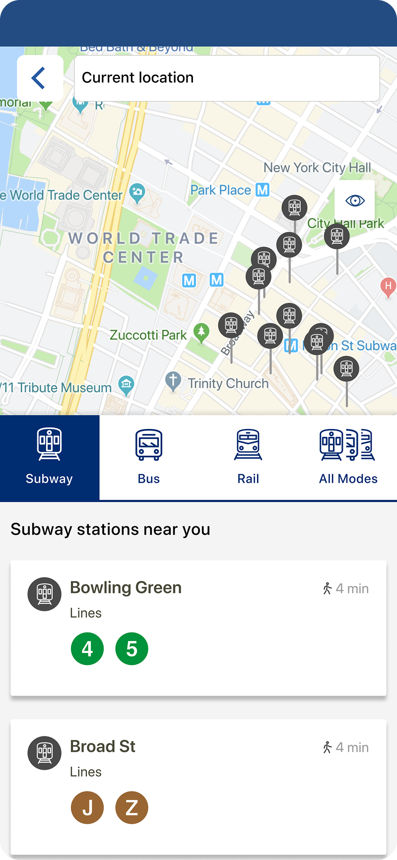
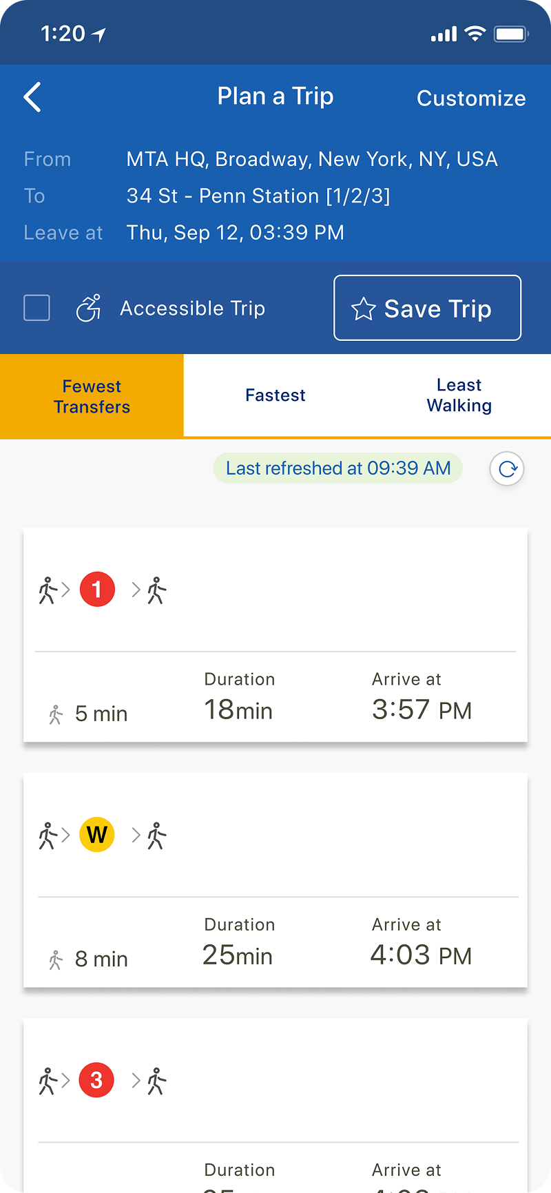
I initially wondered how millions of dollars could be spent on a transit app like MYmta, which was uniquely baffling in its design and user experience. When you opened the app, you were immediately greeted with an empty "Favorites" space. Outside of the transport icons, it did not look like a transit app at all and was a complete departure from other products like Google Maps, Apple's Maps, Citymapper, and even Uber & Lyft (both had added transit features). The frustrating aspect of MYmta was that you could not use the map to explore the surroundings; you were only limited to tapping the station and stop icons around you. Arrival times for the routes were hidden and difficult to find being 4 or 5 taps from the home screen. After my findings, I setup usability studies with MTA riders to see how users struggled in real time using this app.
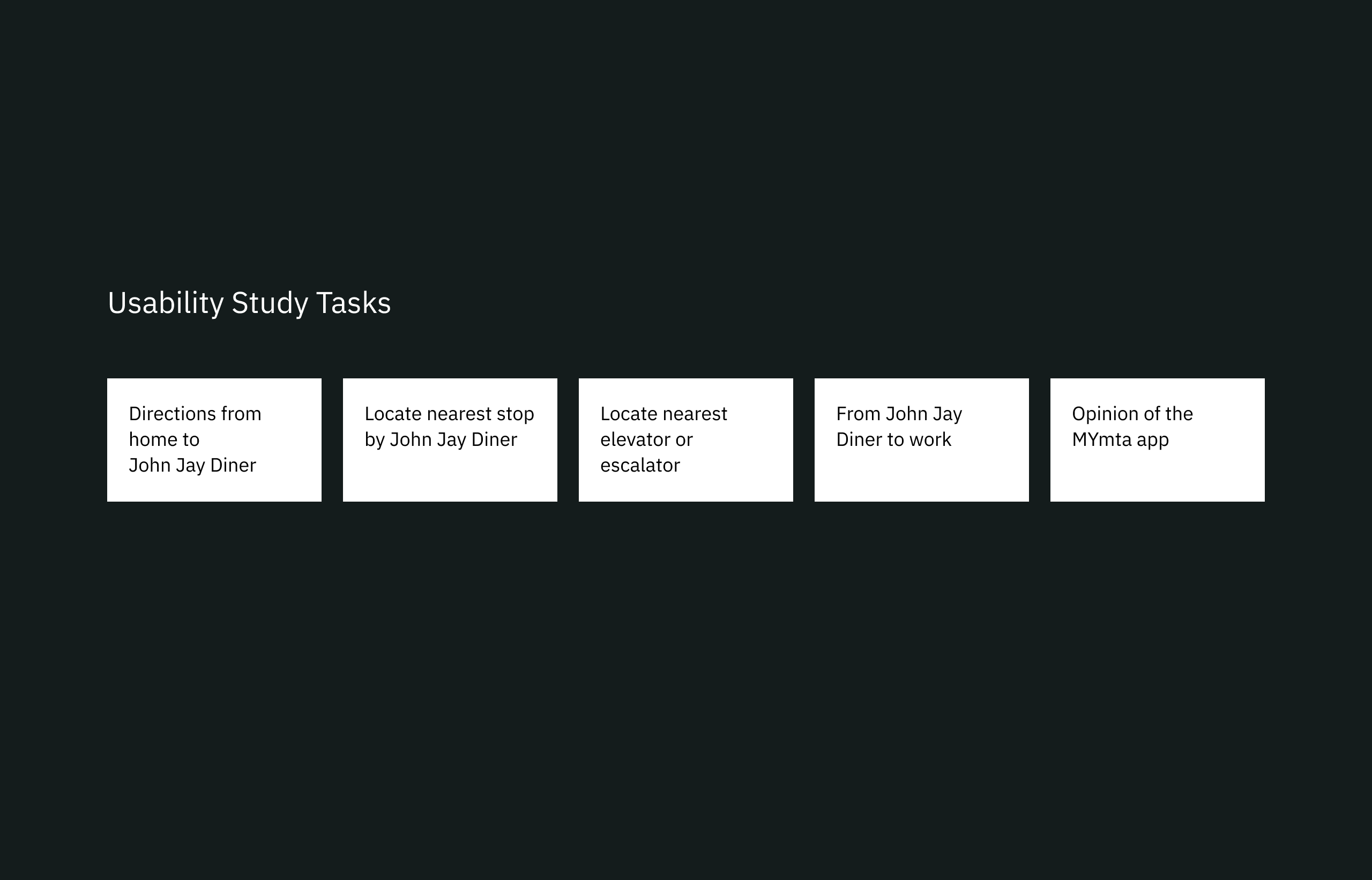
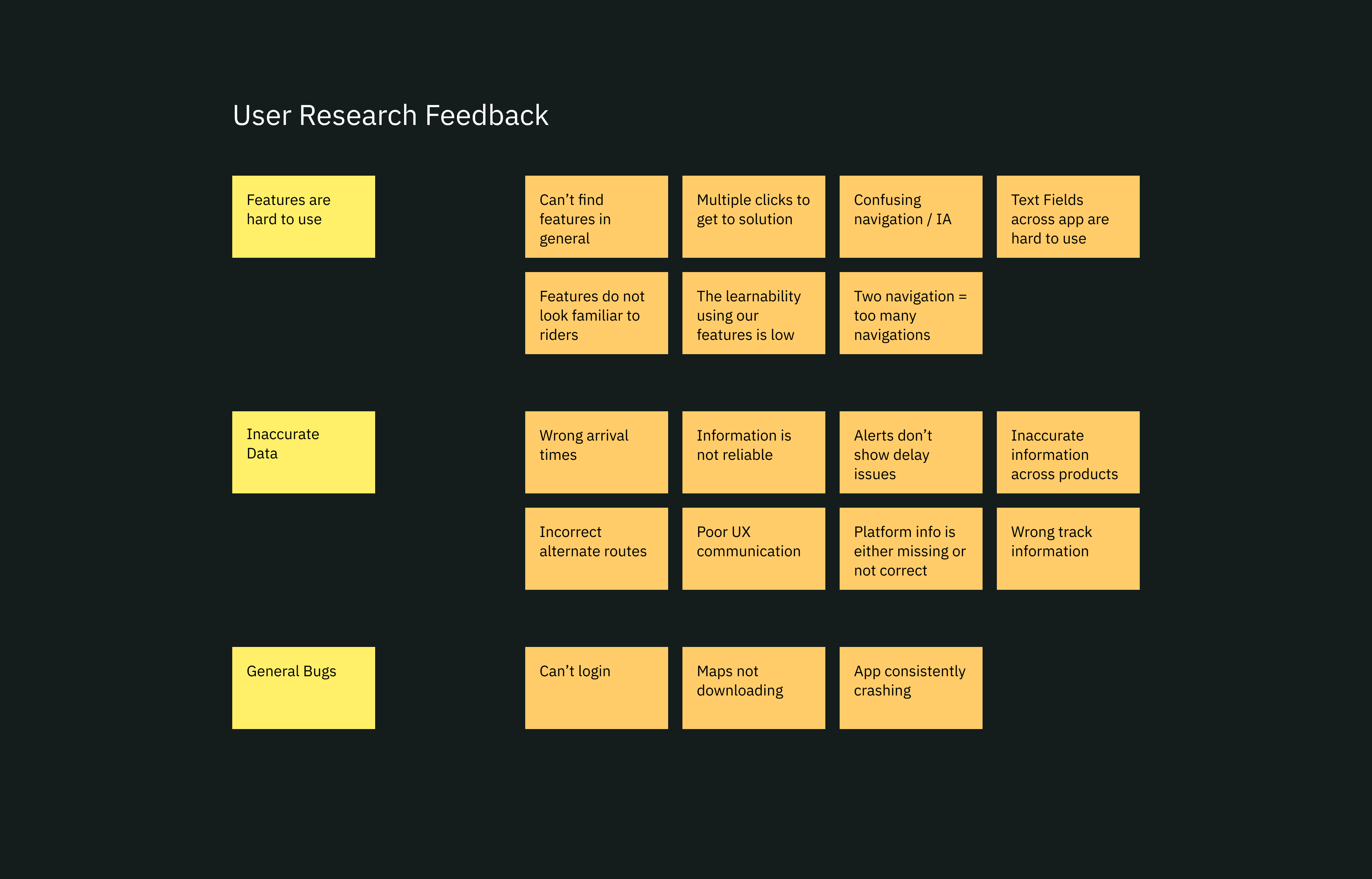
During the usability studies, we asked riders to complete a set of tasks using the MYmta app. We noticed that the longer the riders were using the app, the longer it would take them to complete tasks, which is the opposite of good UX. We even had one rider who took 7 minutes to complete a task of finding a location from their nearest stop. When asked if the rider understood the question, they simply replied saying they could not find where to get directions from the Nearby screen. This task actually required 3 taps to get back to the Plan A Trip screen but the rider could not figure it out. The percentage of completed tasks for the riders during the usability testing went from 90% of participants completing the first task, to only 50% completing the last. After collecting the feedback and concluding the initial rounds of user research, we set forth to make a more map-centric, user-friendly app that had features that were 1 or 2 taps away from any screen.
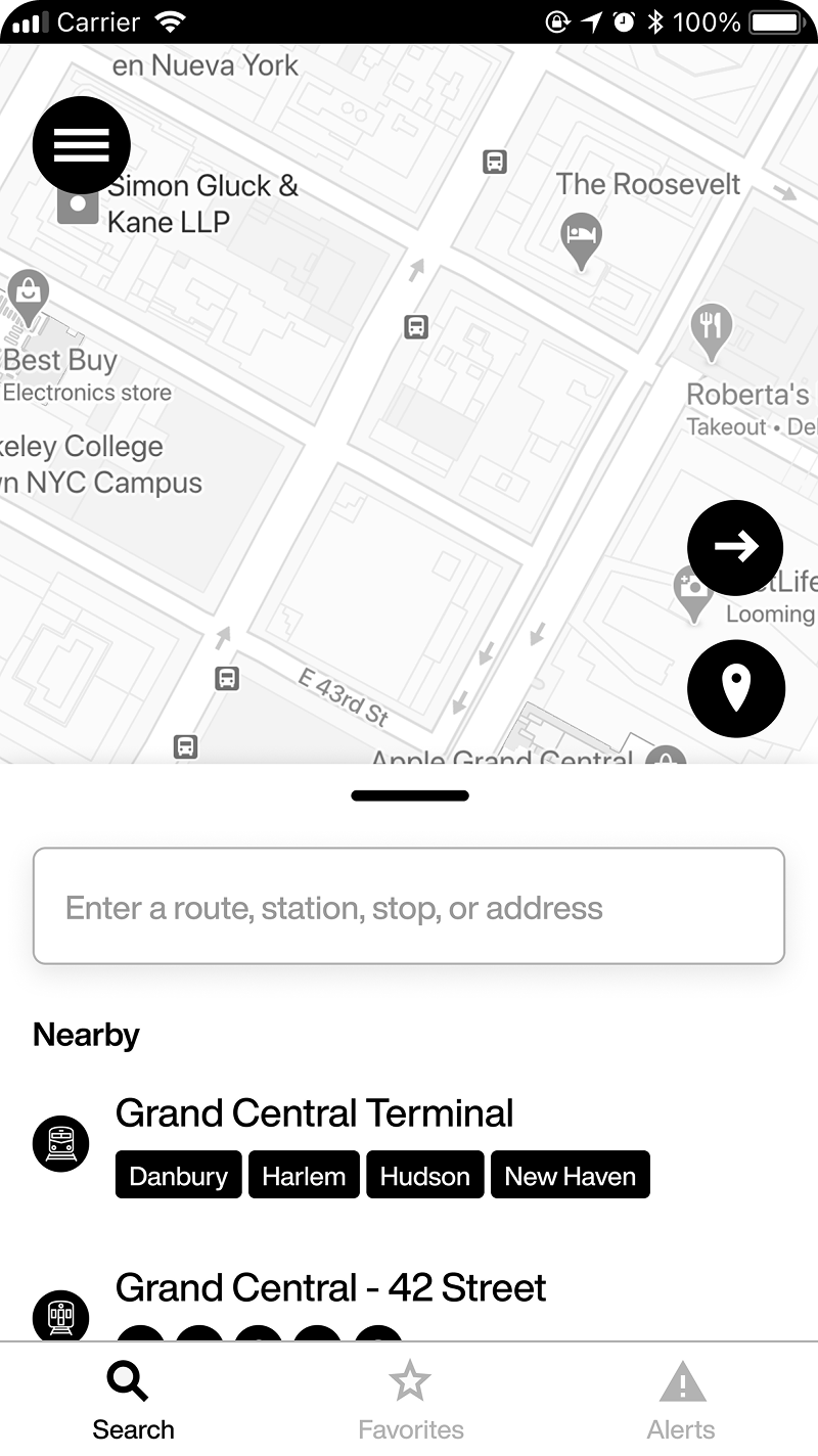
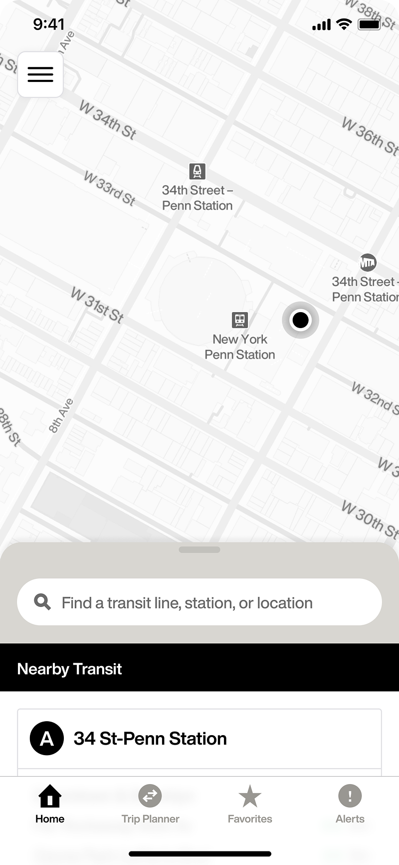
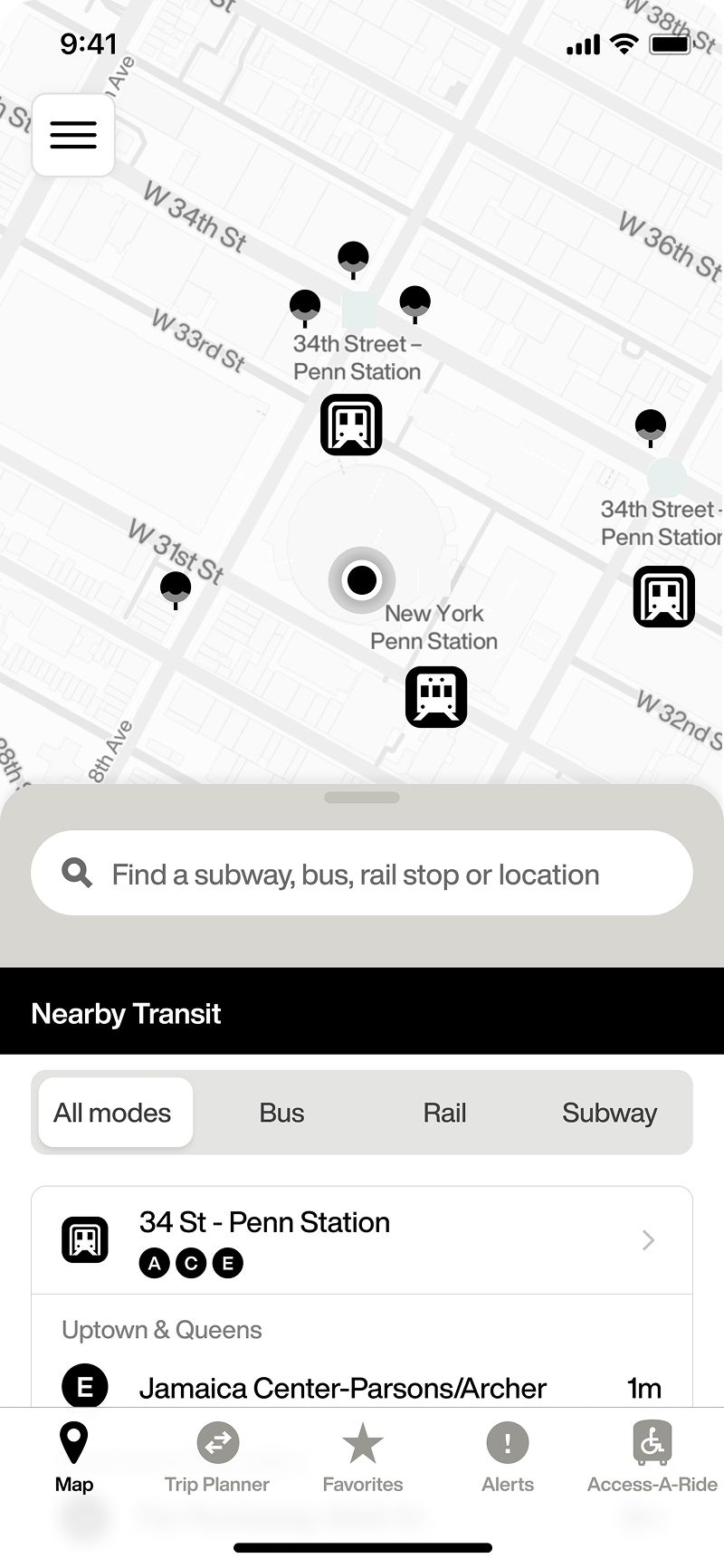
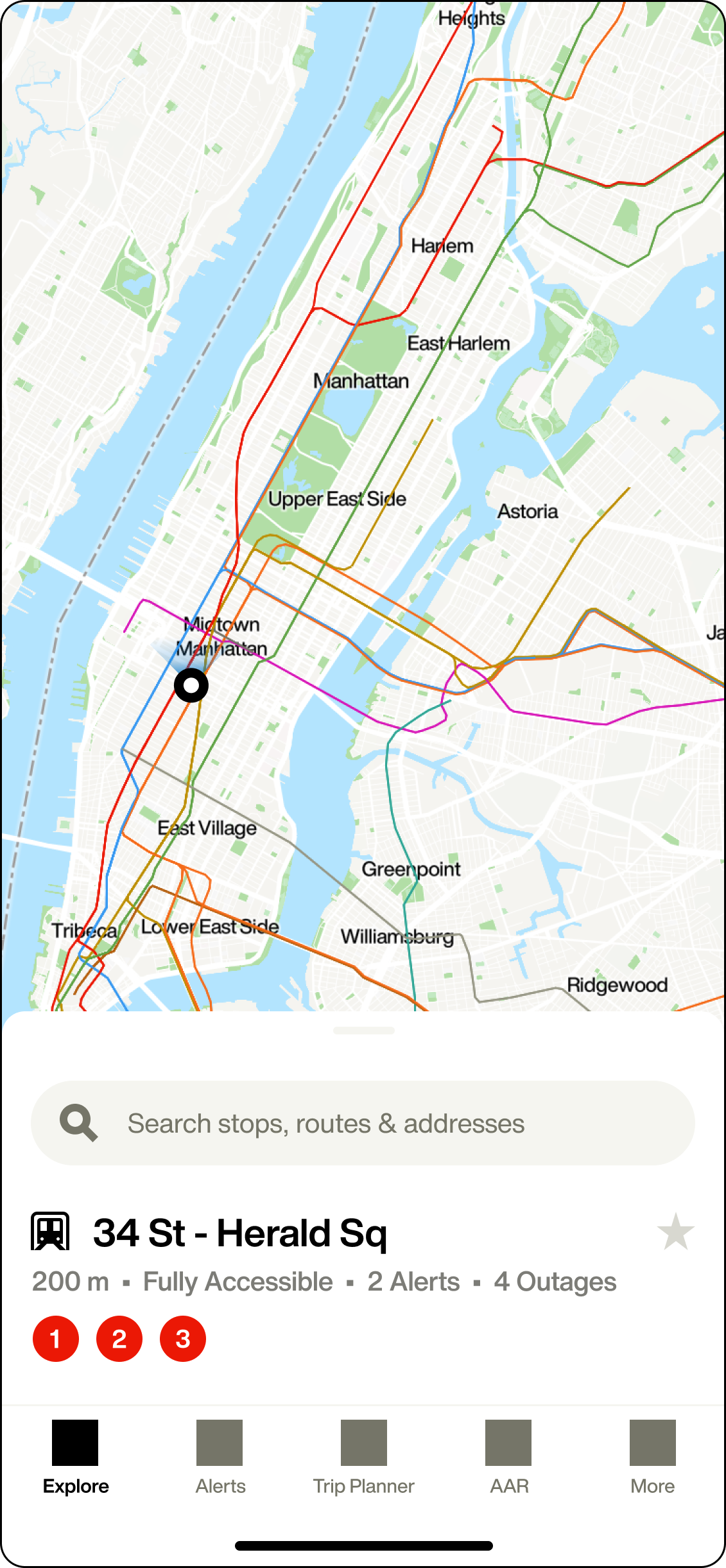
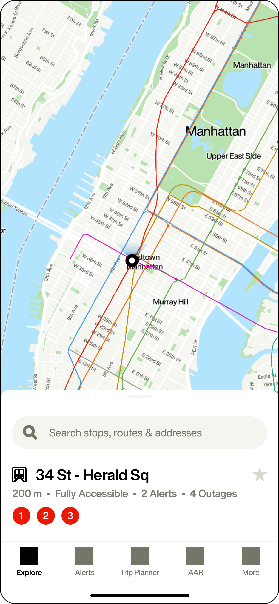
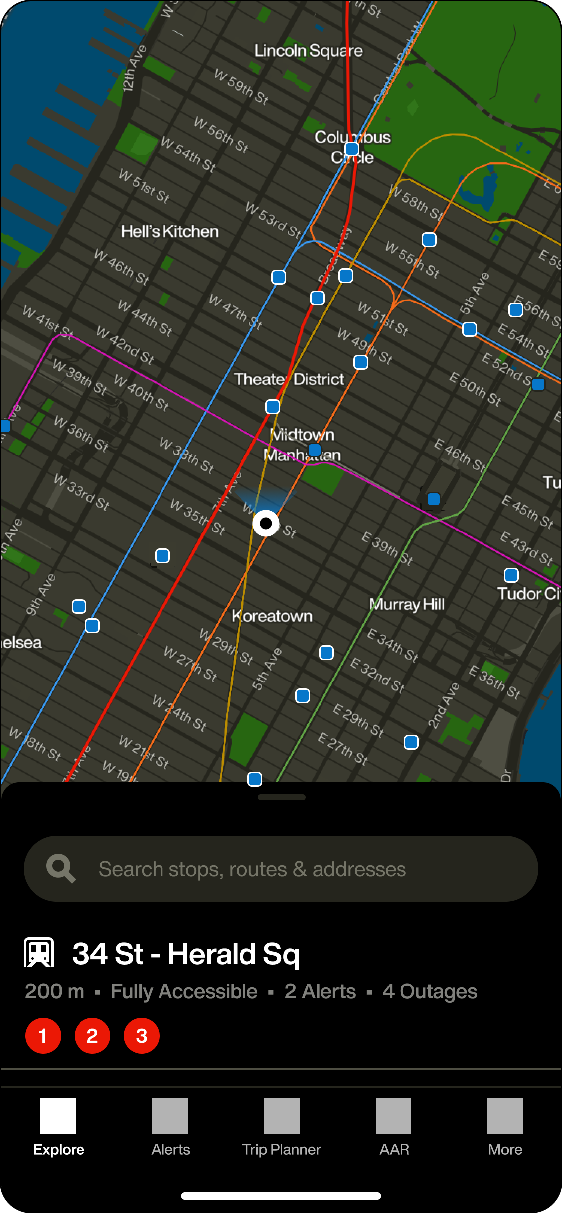
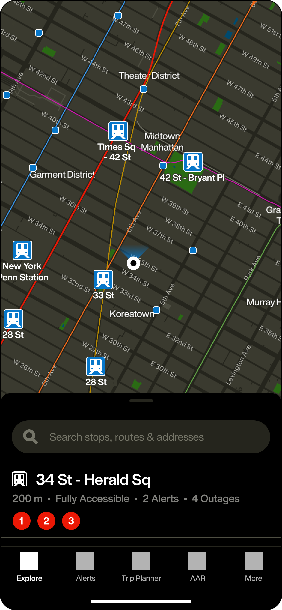
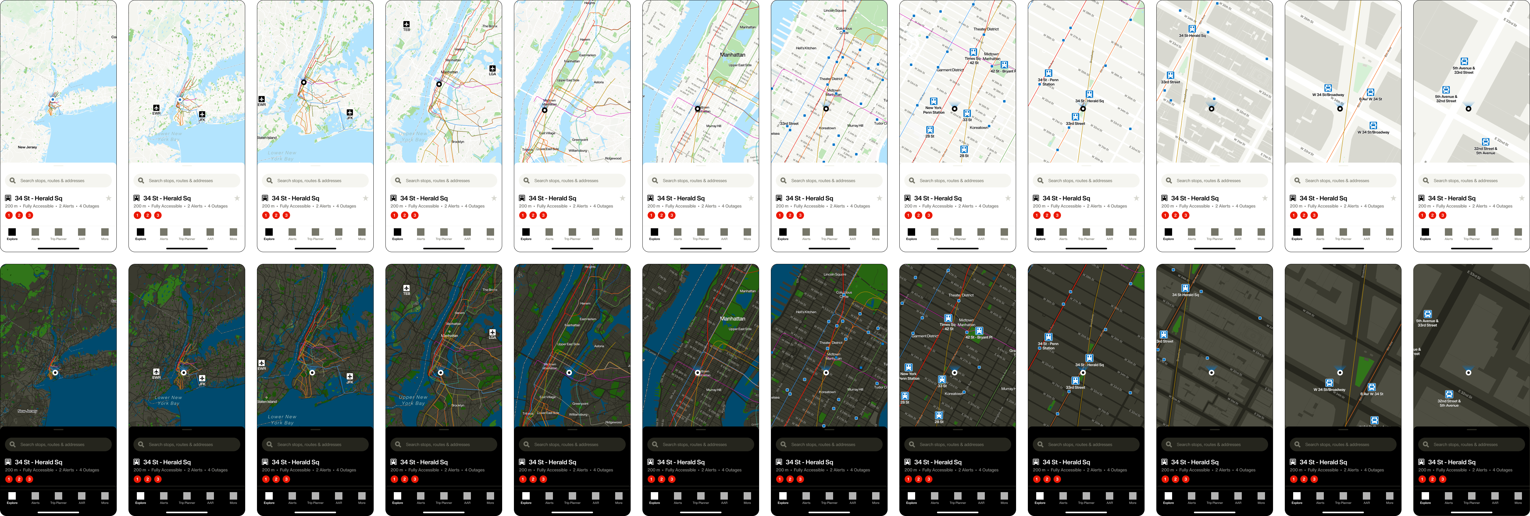
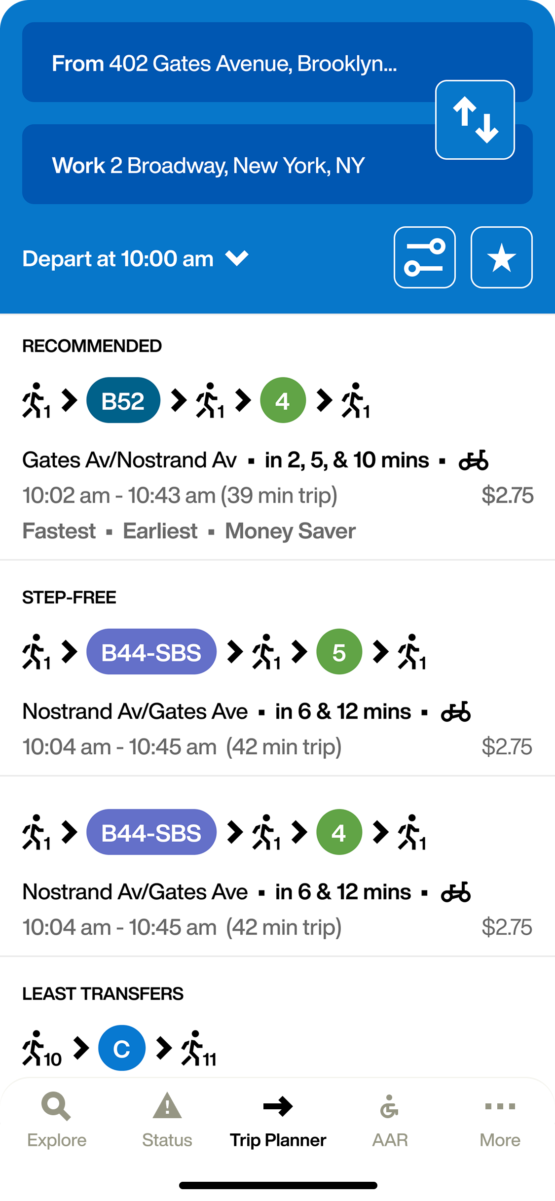
There were dozens of rounds of wireframes and prototypes created during a two-year span. We used Mapbox to experiment with map views and add our updated typography, colors, and icons. We also integrated APIs from the rail, bus, and subway data to plot route lines, stations and stops; essential things that were missing in the MYmta app. With a fixed navigation bar at the bottom of the screen, features were one tap away and arrival times were no longer hidden behind additional interactions.

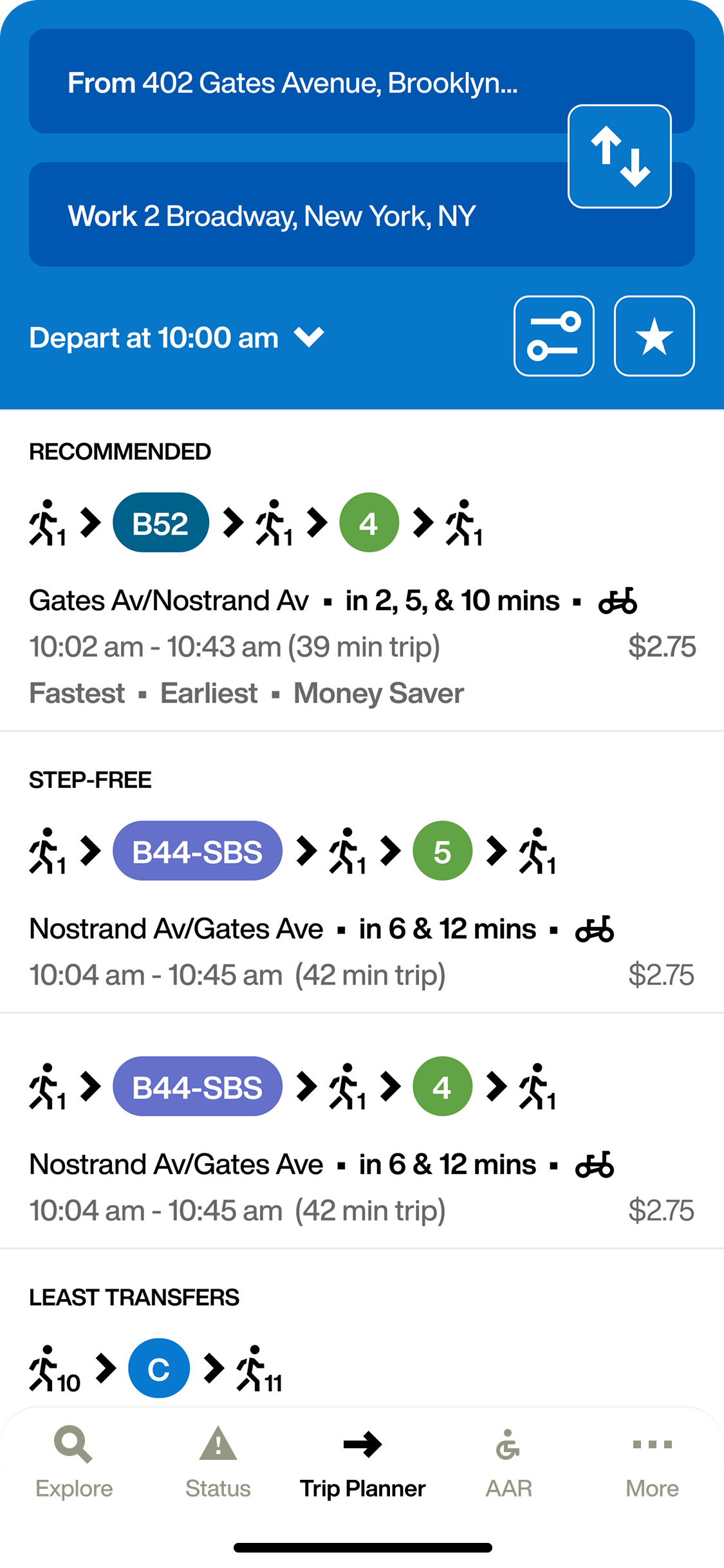
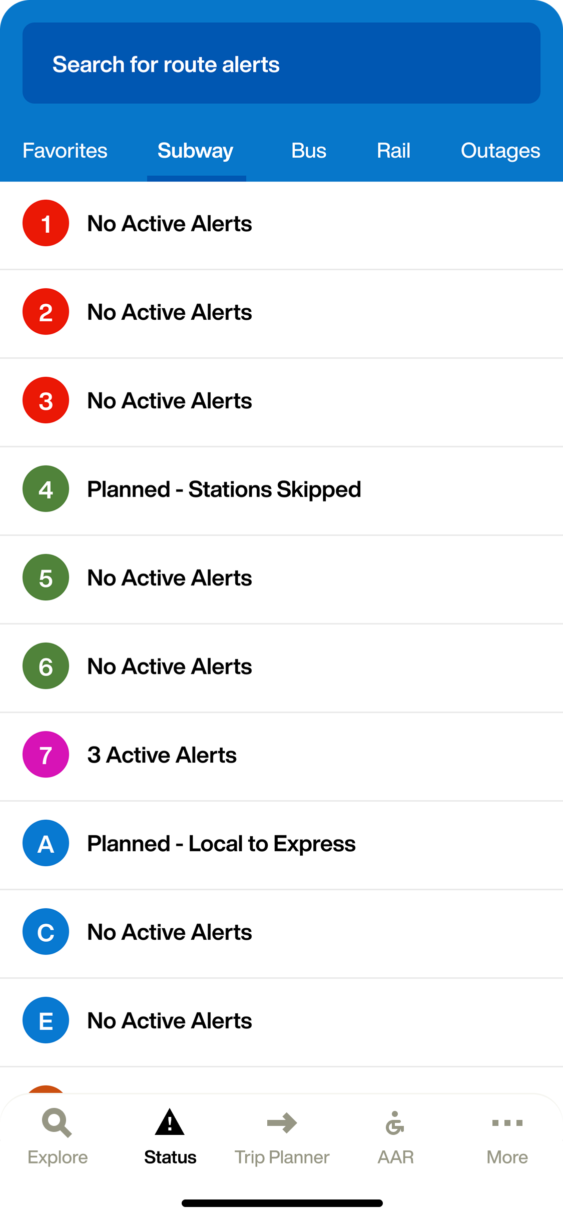
Even though my job was to make the app more map-friendly, there were other features on the app that needed improvement. Our team worked with transit company Axon Vibe to flesh out the remaining feature updates needed. Following 4+ years of development, we launched a foundational transit application in early 2024 to seamlessly integrate with the MTA's digital ecosystem, including Digital Screens, TrainTime, and OMNY.