
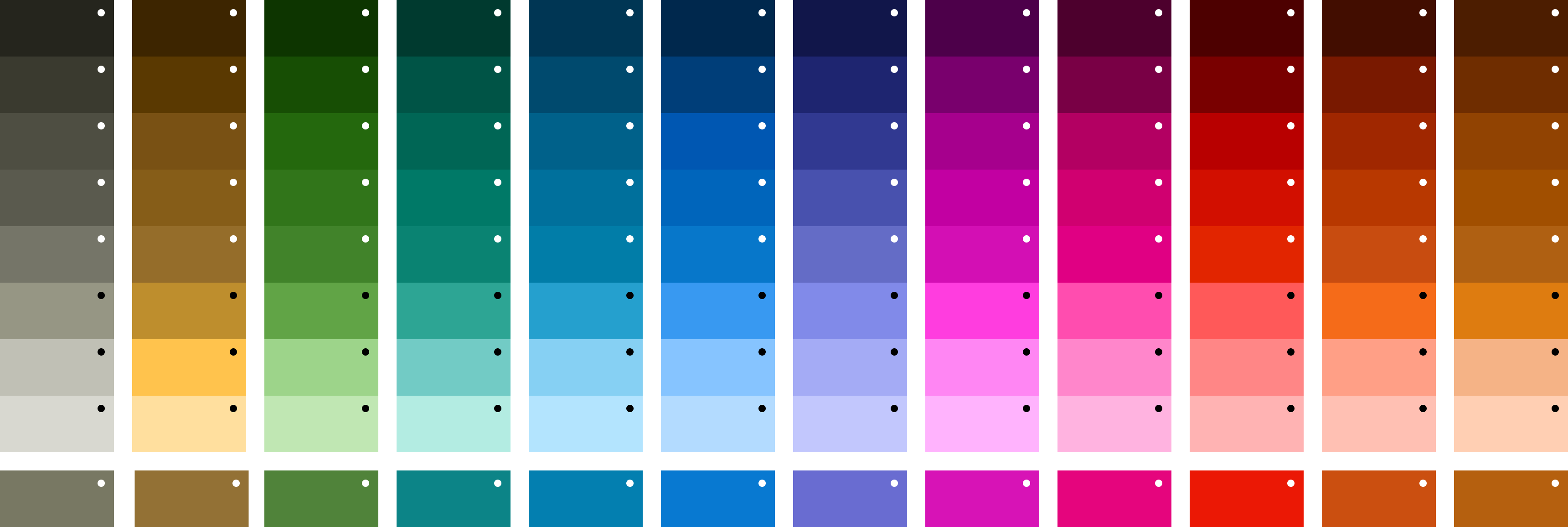
The Metropolitan Transportation Authority in New York City has three modes of transportation: bus, subway, and rail. Each of these modes have route that can be identified by name, number, letter and all have associated colors. The problem with color is that when viewing on different digital products, they change no longer looking like the original. My task was to create a color system that unified both the route colors and the interfaces these colors would live on for MTA rider's touchpoints.
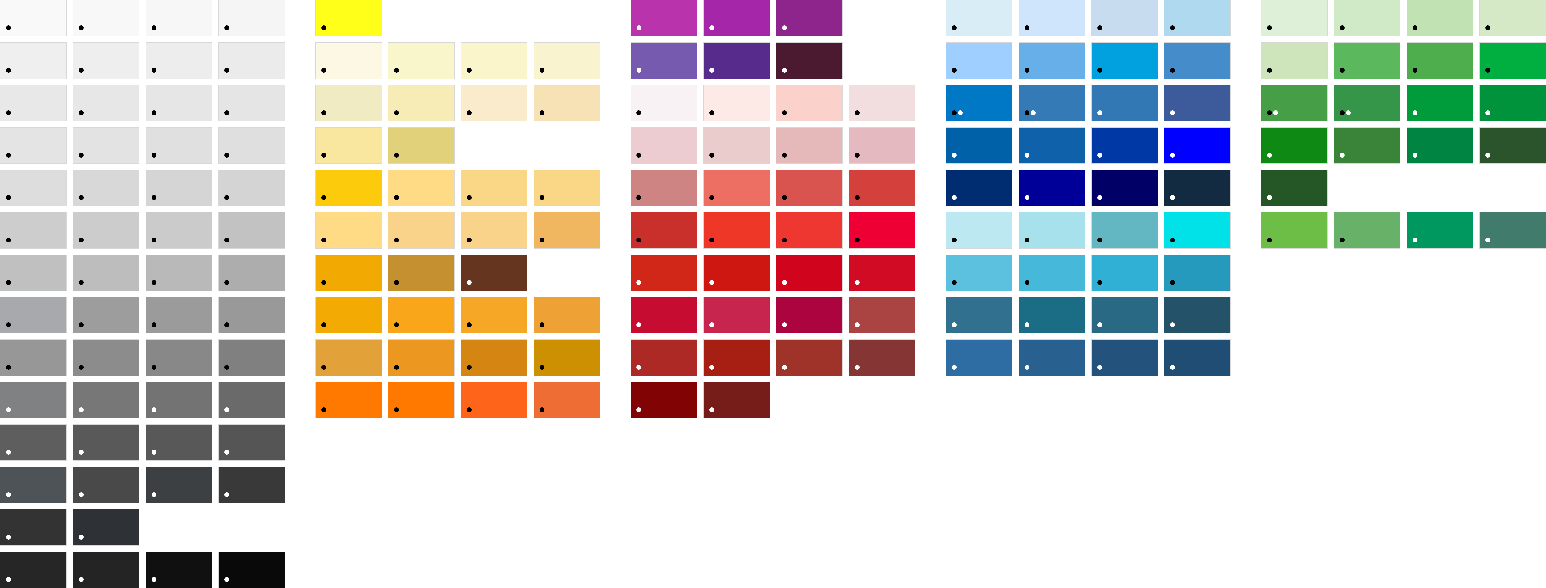
During the inventory audit for MTA's digital products, I noticed how the same items used different colors depending on the interface. The MTA blue, route colors, and indictors all had mixmatched variations that came up to a total of 215 colors used throughout MTA's ecosystem. To list a few of these hues, this include 48 gray variations, 36 blue variations, and 36 different reds and purples. The MTA lacked a unified color system for its digital products. Instead, platforms like TrainTime, MYmta, MTA.info, and the physical digital screens each operated under fragmented visual schemes.


The Web Content Accessibility Guidelines (WCAG) determines readability using a contrast ratio based on the relative brightness of the color and its background. Higher ratios indicate stronger contrast and improved visibility. Our goal was to have at least a 3:1 reading for all of the route colors on black (dark mode), white (light mode), and gray (maps) backgrounds that they would live on. To find accessible color options, I took each current route color and created 56 accessible options. These 56 options were narrowed down to 7 and were sent for usability studies with MTA riders. I found a group of colorblind individuals who could not see blues (tritanopia), greens (deuteranopia), reds (protanopia); along with riders who had trouble seeing blues (tritanomaly), greens (deuteranomaly), reds, and could not perceive any colors at all (achromatopsia). They all used the transit system on a regular basis and all had horror stories trying to navigate the system with MTA's accessibility barriers.


After getting feedback from the colorblind riders on the colors they thought had the best visibility, it was time to test out some color palettes. We used the Munsell Color System to find 9 shades of each hue which were based of all the route colors. From this palette we needed routes colors to be unique and have 3:1, 4.5:1 / 4.66:1, and 6.98:1 color contrast. This was specifically so that each route color can be accessible on their alternative light and dark backgrounds. For example, a blue route with a 4.66:1 ratio on a dark background becomes a 4.5:1 ratio on a light background. I came up with an 108-color palette that could scale to digital products and integrate with existing interfaces to get quick public feedback.
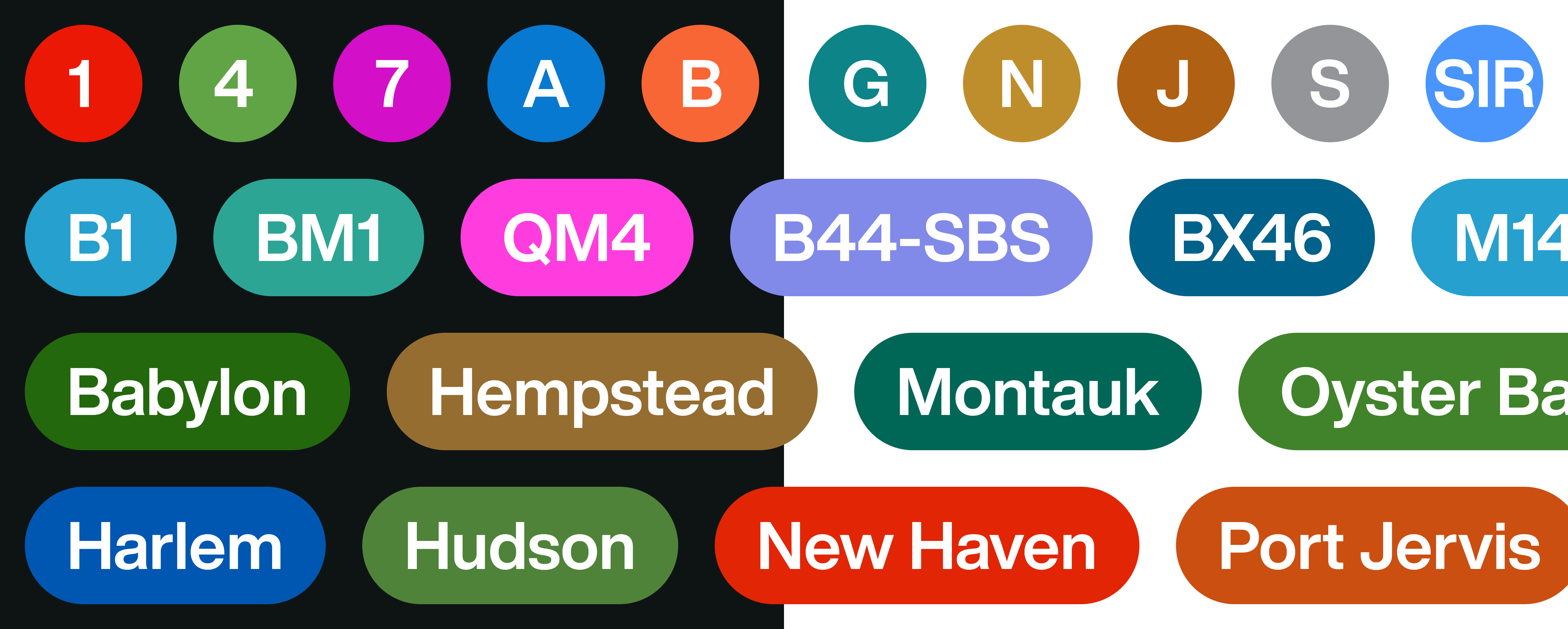


Most of the pushback centered around the G and N/Q/R/W lines, which represented the most drastic visual color changes. In contrast, updates to the other routes were much more subtle and nearly unnoticable to most riders. For the yellow N/Q/R/W lines, I wanted to eliminate the black lettering inside the transit bullet. Currently, this is the only line that requires this design exception. For the G Line green, I was looking for a hue that was not so similar to the green for the 4/5/6 Lines. Teal made the most sense as it is technically still a green hue and gave a nice contrast against the competing greens.
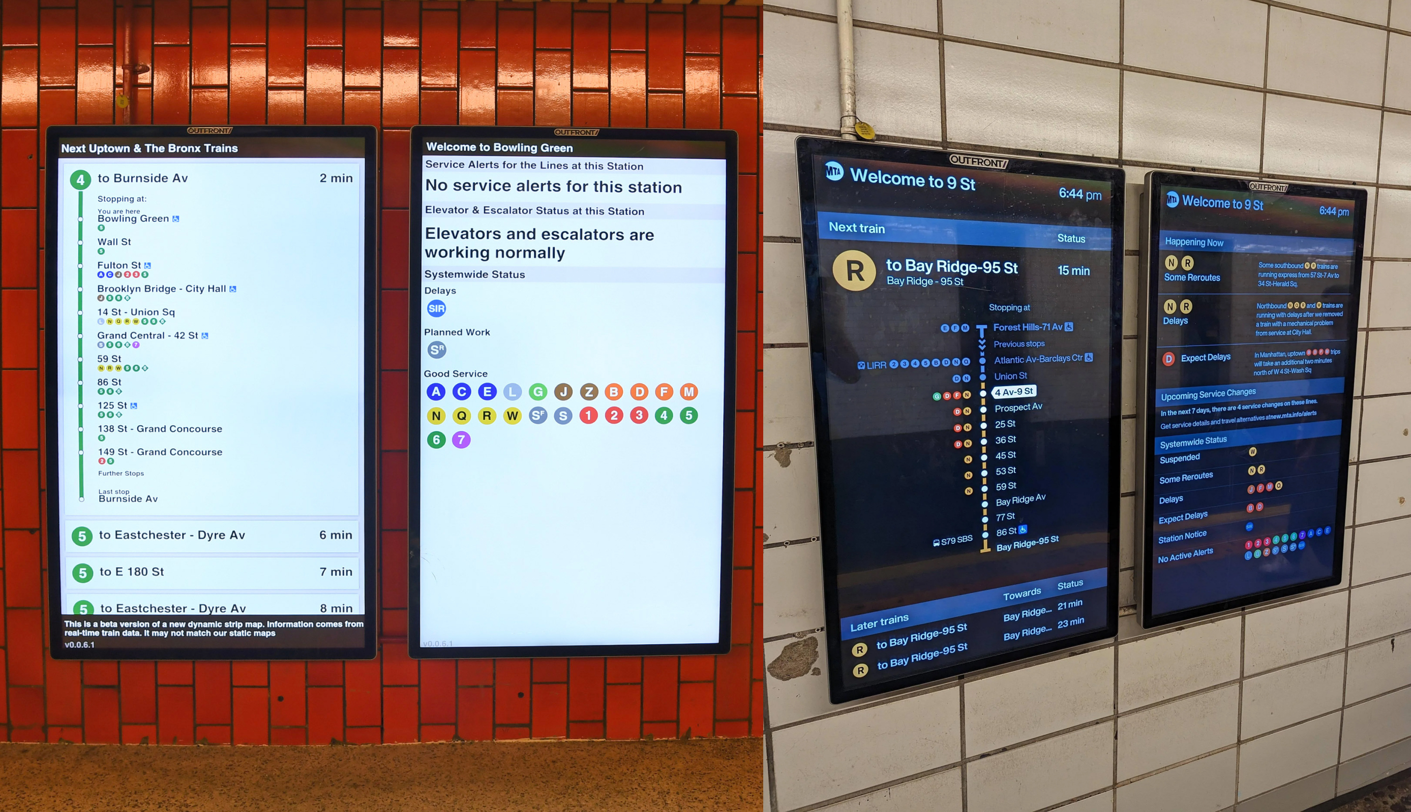
Since the MTA app and MTA.info were still in the process of being redesigned, we decided to add the new colors to the subway Digital Screens to get feedback from the riders. The dark screens matched the signages for better brand recognization and showcased the palette's flexibility.
I found it very difficult to get further adapation to turn this color palette into a more in-depth color system. The teams outside of my Digital Services like LIRR, MNR, maps etc. all loved the idea of unified visual identity but continued to think about their own modes and products. Also as if a MTA rider only travels by bus, rail or subway. At the end of the day, I was glad to bring accessibility issues to the forefront of a complex system like the MTA and help people look outside their perceived world of color.