
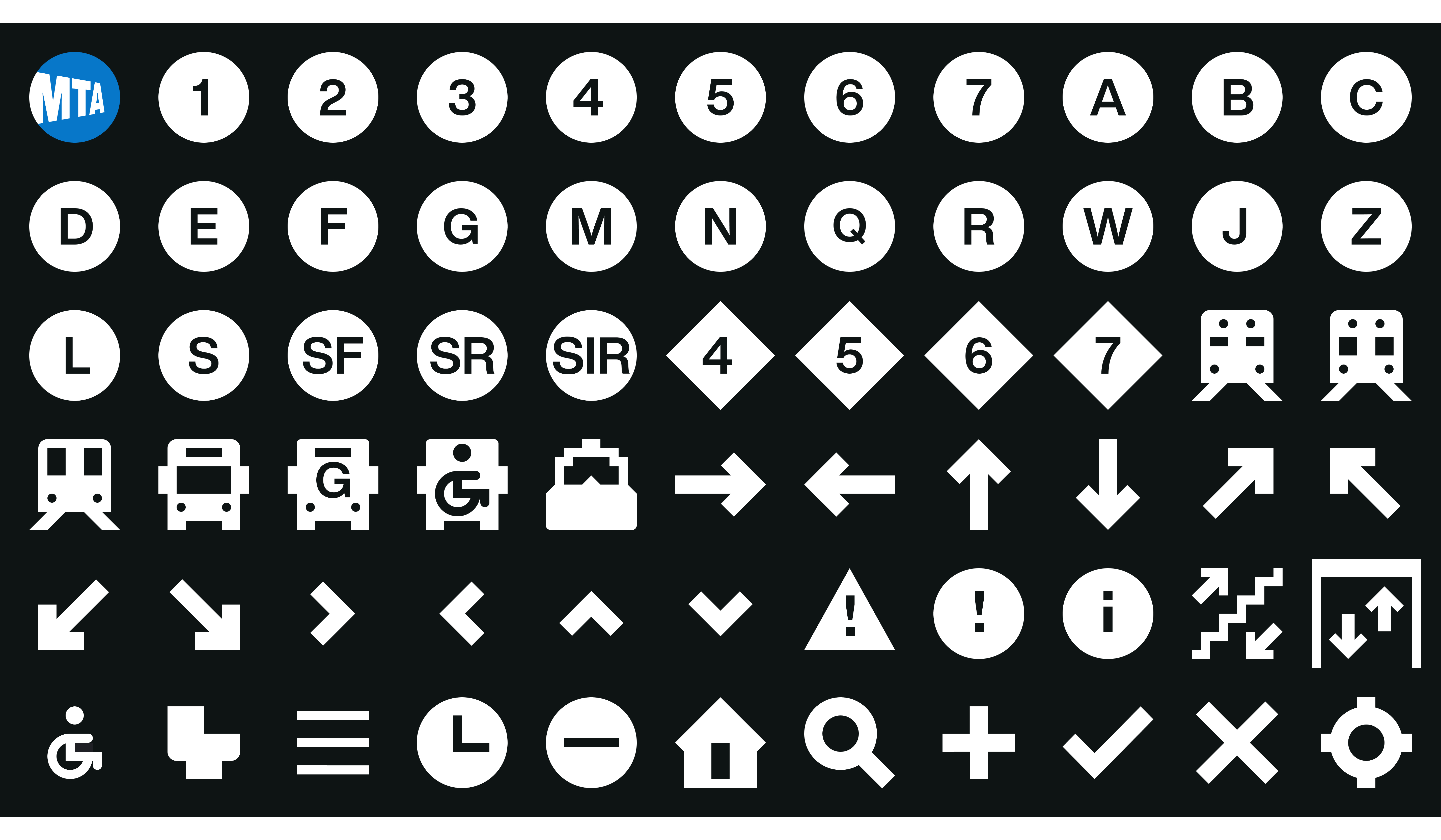
Across New York City's transit digital products ranging from websites and mobile apps to digital screens, you can find a wide array of different kinds of icons and symbols used. The problem was that these icons were a large departure from the well known subway bullets and arrows that are closely associated with the MTA. My job for the country's largest transit agency was to come up with an iconography system that made it easy to update outdated icons, create future icons, and pair nicely on the various touchpoints along a rider's commute.

The problem with the icons across the MTA’s digital products was their inconsistent — and at times confusing — design. From dozens of meetings and workshops, we came up with three core principles that could identify what good (icon) design embodied and could be explained to any new MTA team member or any stakeholder.
The icons needed to be simple and easily identified by both native riders in the city and tourist riders who live outside of New York City. Sometimes an icon could be the difference between making it to your destination Uptown or going the complete opposite way Downtown.
We created guidelines and rules to be able to quickly and easily update current icons, design future ones, and ensure the icons looked good on all screens whether the rider was viewing from a mobile, desktop or digital screen.
With hundreds of millions of unique riders each year coming from all walks of life, we needed riders to be able to recognize the new icons without any color, language, or accessibility barriers.
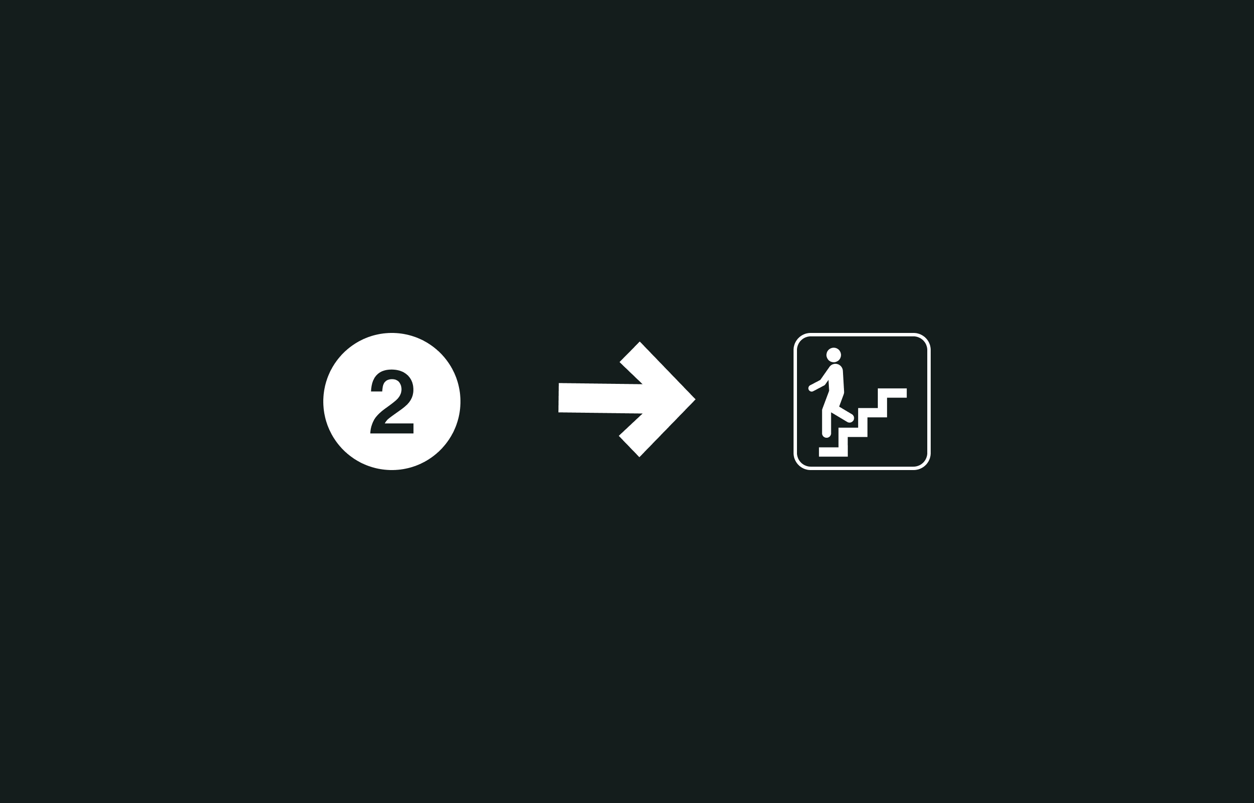
The starting points for this project included the subway bullets, the arrow from the iconic NYCTA Graphics Standards Manual, and the Dot pictograms used throughout MTA's services. In the manual, the subway bullets and arrows were meticulously documented and played a key role in the 1970s transformation of the NYC subway system that was led by Unimark’s Massimo Vignelli and Bob Noorda. But the transition from print to digital subway bullets did not have the same degree of thoroughness and created a lot of inconsistencies over time.

During the inventory audit, I discovered that it seemed like every MTA digital product had their own version of the subway bullet. The website used Helvetica, Apple products had San Francisco, Digital Screens went with Neue Haus Grotesk, and others all had different typefaces. For some reason, the subway bullets were being programmed to match the system's body font as opposed to being the same glyph across devices. I directed the team to finding a singular typeface option that matched our principles and could seamlessly replace the other bullet variants that existed.
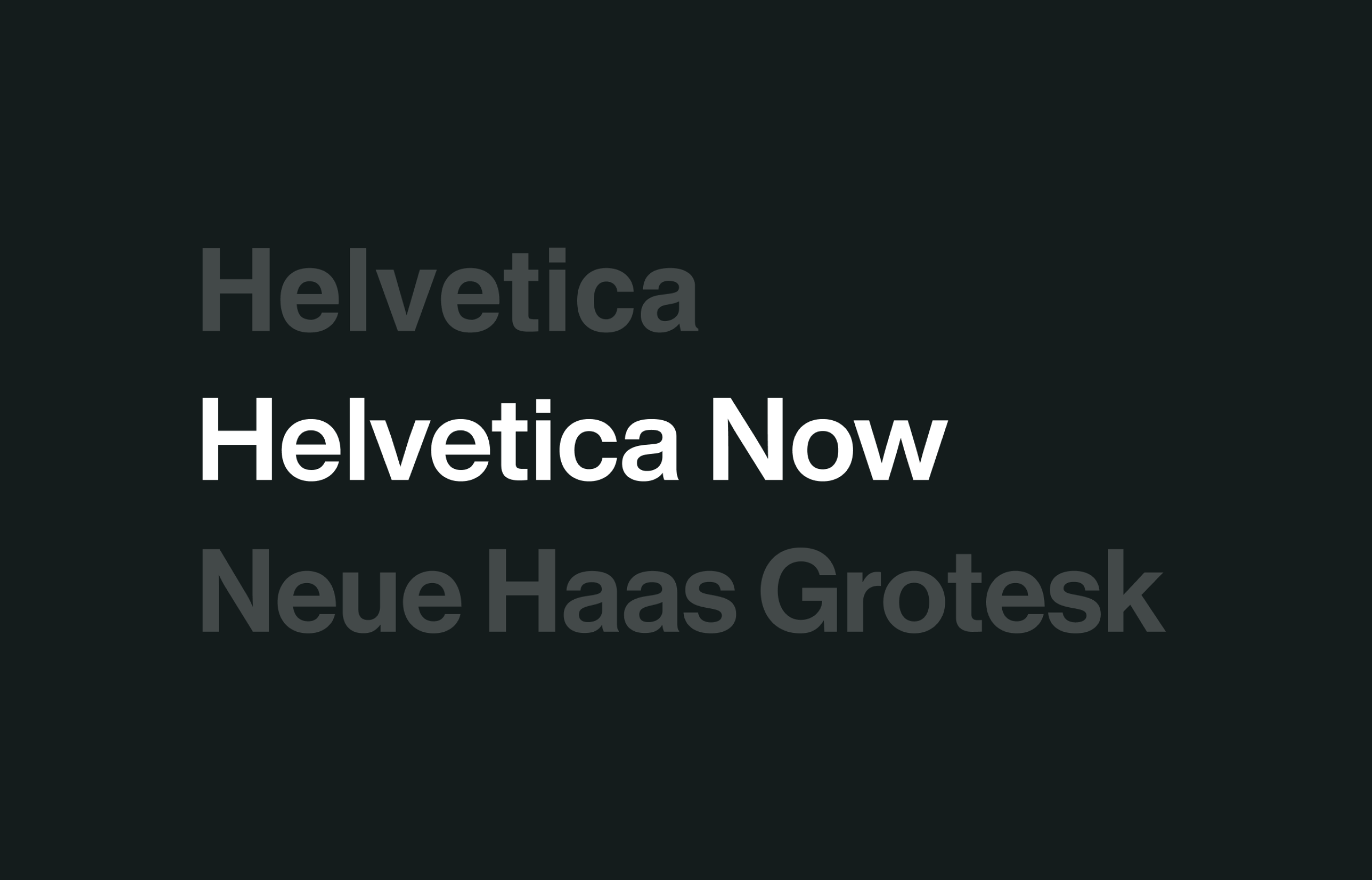
After a few meetings and internal discussions, we found three typeface options that closely matched Unimark's original subway bullets: Helvetica, Helvetica Now, and Neue Haas Grotesk. Each option had its pros and cons, but we ultimately needed a solution that was not only cost-effective, but met our principles of being simple, accessible and scalable.
The Helvetica typeface was not only the most cost effiective option but was currently the most used on the websites and parts of the Digital Screen. The issue with Helvetica we continued to come across was that at small font sizes, readability became a concern. Also, Helvetica is pretty limited to the amount of weight variants that were created. We ultimately decided that we needed to move away from Helvetica without breaking the bank and the user experience.
I convinced the team to push for Helvetica Now because it had been created by the absolute best type designers in the world who were also apart of making Helvetica digital friendly. There were thousands of hours and decades of experience put behind Helvetica Now that couldn’t be made up anywhere or by any other team in the world. The typeface met all of our principals and looked stunning from any viewport.
Grotesk was being used for the Digital Screens but it was never meant for digital. History tells us that both Neue Haas Grotesk and Helvetica are the same but Grotesk has never been updated to be formatted to mobile and desktop screens like Helvetica has.
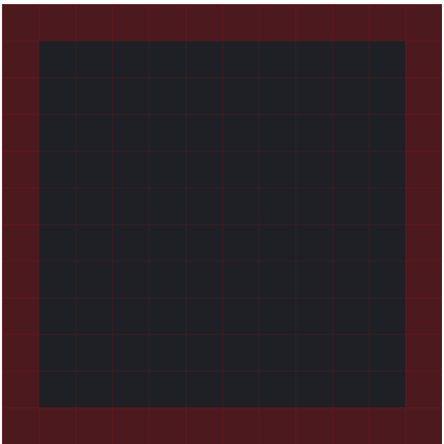
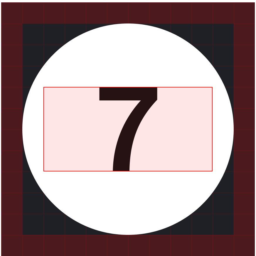
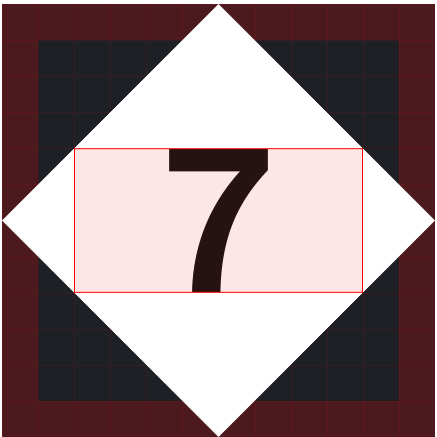
After swapping all of the old bullets for Helvetica Now, we created a starting canvas of 12px x 12px. I worked with a seasoned MTA designer that created the icons under my direction. We wanted to make sure the canvas had equal amount of space for both circle and diamond subway bullets.

A key concern of mine with the subway icons was the inconsistency of the lettering within the bullets. Looking back at Unimark's NYCTA Graphics Standard, all of the letters and numbers had the same height. But over the years for some reason, what I called "MTA logic", the letters started to come in different sizes and even added a subsets (which is hard to see at a distance). The bullets that varied in height included the single character routes being the largest, followed by the Staten Island Railroad, and the smallest being the subset of the S Lines.

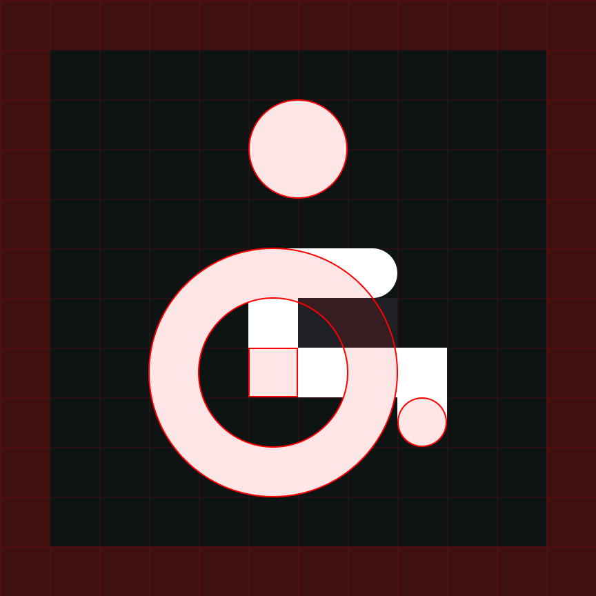
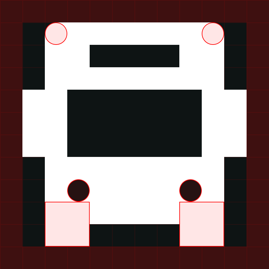
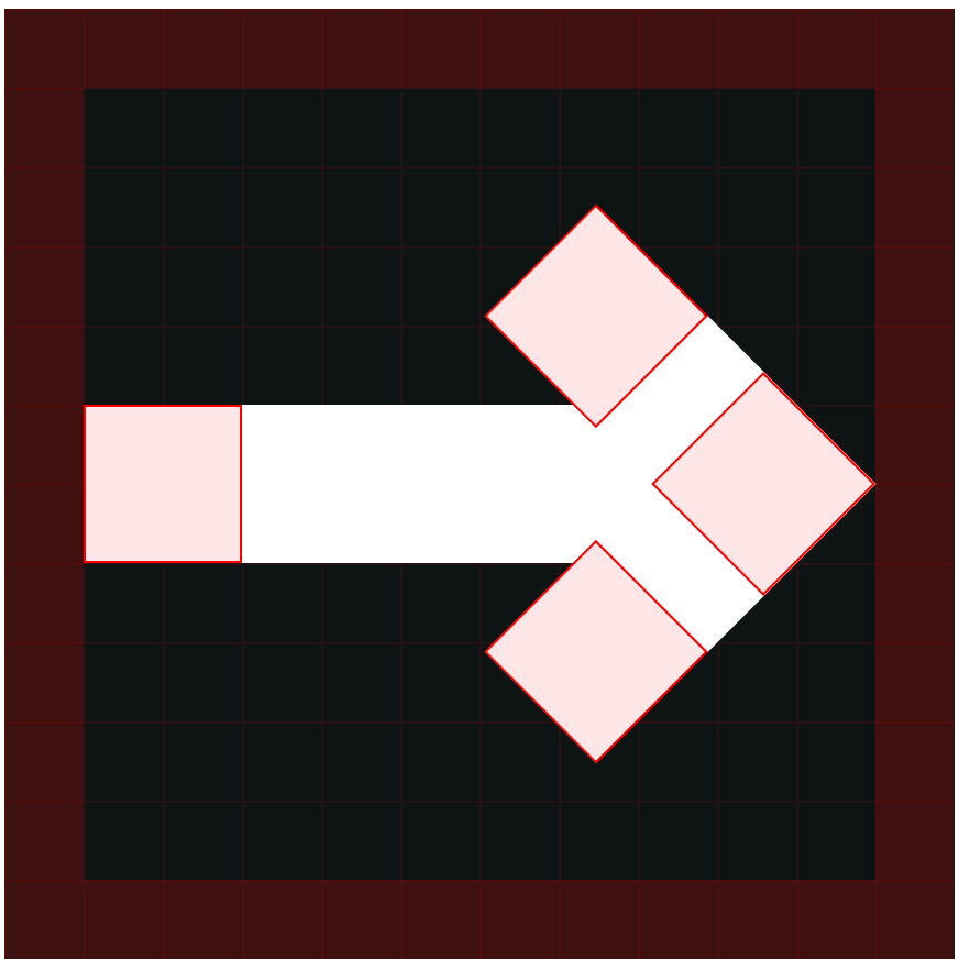
Our Designer Tony Taylor sent me over a file of pictograms MTA used across print, subway, and bus touchpoints across the city. It was exciting to see these graphics because they looked good and were reminscent of the classic graphic designs created by folks like Otl Aicher, Masaru Katzumie, Roger Cook and Don Shanosky (most actually came from Cook and Shanosky). For icons outside the transportation routes, we used the pictograms for inspriation to come up with a process of creating future icons and update older versions. The guidelines were simple: stick to circles and squares shapes and make sure the pixels snapped to the 12px x 12px grid. The result produced clean, consistent, blocky icons that mirrored Helvetica Now and Unimark's aesthetic.